Ever had two tacos at Jack in the Box? Ever wonder what goes into every decision of how to source, price, prepare, and deliver that taco to you? There’s a lot of data that feeds those questions. Jack in the Box sells more than a million tacos a day, so we’re also talking big transactional data. In late 2017, operators, marketers, and sales analysts at this quick-serve giant struggled with these decisions. Their outdated enterprise data architecture couldn’t support the volumes of transactions flowing through the system, nor keep up with the rapidly changing industry environment as new digital channels like delivery and mobile gained prevalence. Through careful coordination of more than 30 agile sprints, we transformed business intelligence at Jack in the Box with a move to AWS Redshift and Tableau in the cloud, and learned a lot about agile data transformations along the way!
1. INTRODUCTION
I spent most of my life in Texas, where just about every town worth mentioning had a Jack in the Box. With around 2,200 locations sprinkled along the West Coast, South and some Midwestern states, Yankees and East Coasters may have never heard of them. Jack in the Box is a craveable brand that dares to be cheeky, or “the curly fry in a pool of regular fries”, with a lovable mascot Jack that isn’t afraid to be provocative in his humor.
Historically, patrons consumed fast food in a very finite set of well-understood purchasing channels: you dine in, you carry out, or you go through the drive-thru. Within the last decade, the way we order and consume foods has radically evolved. Most brands now have a mobile app or some mechanism of online ordering. Even more brands, including small mom-and-pop locations without the tech infrastructure to create an app for themselves, have partnered with delivery service providers to get food in the hands of customers without them having to leave their couch. Could you imagine what would have happened to the restaurant industry if COVID-19 hit 10 years ago, before these infrastructures were in place? It’s hard to remember the times before we could order anything we wanted in a few clicks from our phones, but it was in those times that most of the business intelligence architecture was implemented for these large restaurant corporations. Back then, the ability to quickly bring on new sellers for your brand, or integrate new customer feedback channels into your core data set, wasn’t a pressing issue. No one was really doing these things to a scale that mattered much yet. But by the time 2015 rolled around, these started to become significant revenue channels for brands, and the ability to analyze sales results holistically across a number of experience channels surged in priority.
“Data is the new currency,” you’ll hear people say. Data drives SO MUCH of what happens all around us. Successful organizations have made data-driven decision-making a core part of their culture. In the world of fast food, there are unique and interesting data sets that contribute to every decision, like how should I schedule my labor for next week? Which products should we remove from the menu? Which ingredients are too inefficient to be profitable, and how many of each type should I continue purchasing from my supplier? Is a slow customer experience causing us to lose sales during peak hours?
Many organizations are still behind the curve when it comes to even understanding all of their enterprise data, let alone bringing it together in a way that enables cross-functional predictive insights. You may be looking to move a mountain of information from legacy cubes or inflexible architectures that can’t easily integrate with new data sources into the cloud, or you might already have an excellent enterprise warehouse but are struggling to make use of the data available. Through this journey, our team learned not only how to move those mountains, but to do it in an agile way, with a process that could scale across any number of data sources or views (see Figure 1).
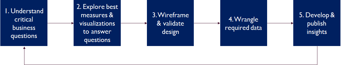
Figure 1: High-Level Analytics Design Process
2. BACKGROUND
2.1 Megan’s Background
I’m a Business Architect at Seilevel who joined Jack in the Box as a consultant in early 2018, right as they were diving full force into their data evolution. I grew up savoring the Sourdough Jack and those delicious curly fries. After starting my career in the world of magazine publishing, I lucked into discovering my passion as a software product manager. More particularly, I was drawn to leveraging data and analytics to build better products and make better business decisions. As a certified agile trainer and product management consultant, I already had a strong grasp of agile coming in, and felt comfortable coaching product owners and developers on how best to leverage the methodology. I was just coming off of a multi-year engagement with a Fortune 50 company building a greenfield data insights platform when I was assigned this project. I was a little wary to leave the team I grew to love, excited to learn about the world of fast food, and also slightly terrified to be joining a new team working with a tech stack I was only somewhat familiar with. I already had a love for data, but had never tackled a transformation this large. My biggest fears include snakes and disappointing my teammates. I was hopeful I wouldn’t have to face either of these as I landed in San Diego for the first day on site.
2.2 Jack in the Box Team Background
Meeting the team the first day certainly started to alleviate some of my anxiety. We were blessed with a rock star team that evolved through the course of the project. In the beginning, we needed to burst capacity to get through the mountain of scope that needed to be migrated to the new environments, so we leveraged a team of both onshore and offshore data engineers and front-end developers. In addition to our Seilevel resources helping drive the product side, we partnered with TEK Systems for engineering and solution architecture expertise. Anchoring the team on site (and still holding it down today) were two full-time Jack employees who had been on the BI team for a few years: Data Architect Poonam Chaganraj and Data Engineer, Meera Jadhav.
With a voracious appetite for learning new data engineering technologies, Poonam came in with expertise in Oracle and SQL, and didn’t know much yet about working in the cloud, AWS, or Redshift. He was somewhat familiar with agile and had worked with user stories before, but was unsure how we could break down a large piece of scope so that multiple resources could be working on the same component in parallel, while keeping the end-to-end big picture in mind. Poonam is one of the most positive, hardworking people you’ll ever meet who never shied away from learning a new skill overnight. His favorite food is Thai, and when asked about his biggest fear, he’ll tell you stories of his childhood with dogs running down the street, chasing and biting his elbows! His favorite color is orange; he drives a fabulous orange Lexus that I loved to see in the parking lot every morning, for he was always the first one in the office.
With an impressive mastery of skills on both the data engineering and visualization side, Meera also came in to the project with a strong background in Oracle and SQL. She was somewhat familiar with agile before we got started, but she’ll tell you that initial understanding was quite different than what she knows now! She had never used a burndown chart before. She was used to getting stories that were vague and that hadn’t been groomed, which made estimations somewhat impossible. When asked about those early days, Meera describes, “The transition was not smooth to be honest…initially we committed to a task, and we estimated it to only take 4 hours. We were not used to giving estimates. Then we started working on the task and realized no, this is dependent on this other task, or this dashboard is dependent on a data source that hasn’t been engineered yet. We didn’t get the concept of grooming, and we didn’t know how to estimate. So that task would turn in to 2-3 sprints. Learning estimates, understanding how to break down tasks, and learning dependencies were really important. It wasn’t easy at first, but each sprint got easier and our estimates got better.” Meera is a dedicated mother to two beautiful daughters, and contributed so much value to the team through the course of this project. Her favorite color is pink, and while not much of a foodie, does enjoy a dessert called Khoya. Like me, Meera is afraid of creepy, crawly things—most particularly, lizards.
2.3 Project Background
The scope of the problem at hand was huge: we had three legacy reporting solutions, two different data warehouse environments (Oracle and SQL), 1200 users, 50+ data sources, and hundreds of reports. And we had a mission to retire all of this within a year, while moving everything to a modernized AWS Redshift + Tableau environment in the cloud. HOLY MOLY CANNOLI how on earth are we going to meet these objectives with such a massive amount of scope? Under the leadership of a new, visionary CTO (Miki Hardisty), we formed the first agile team within the IT Architecture & Innovation Portfolio at Jack in the Box: Jack DnA.
So how much data is generated from a single transaction? You may think of your order as containing fries, a drink and a burger. Of course we capture those details, but a single transaction can result in a wealth of attribution:
- Products contained in the order;
- Every minute modification (extra tomatoes, no sauce, add bacon for $.50);
- How your order was captured;
- Who took your order;
- How quickly your order was fulfilled;
- How your order was obtained;
- How your order was paid for;
- And later, if the customer so chooses, how they felt about their order experience via survey results.
This one order could enrich 3-5 fact tables storing different details. In the single lunch hour, you could have tens or hundreds of these transactions from a single location. All of this adds up, and the sheer volume can be overwhelming if you’re not sure how to wrangle and capitalize on all of this detail.
In product sales analysis, not only are new dimensions like order capture and dining mode important as the industry evolves, but also the ability to very granularly inspect the behavior within each transaction, in order to inform a more advanced customer engagement model. If a customer selects product A, which product are they most likely to select next? Based on a mobile customer’s past transaction history, which deals or offers are most likely to result in a conversion? Traditional data architectures before solutions like Redshift and Snowflake came around to support the OLAP (online analytical processing) use case often included cubing your big transactional data so that you could analyze aggregations on select dimension sets quickly. Cubes basically take every possible dimension combination with your facts, and overnight pre-aggregate these results so analysts can explore the rolled up data by product, or day, or whatever other dimension slice is supported in the cube. When you take the amount of data flowing into our transactional systems and try to cube it nightly, what started to happen almost weekly would stop the decision-making of sales analysts in their tracks:
- Cubes would take 12+ hours to build, and if there was a single failure, it could take days to rebuild and recover.
- Cubes were virtually impossible to change; the amount of work and complexity that would go into adding even a single dimension in the model would introduce more risk than it was worth. So, the behavior around any new order capture mechanisms or marketing channels was impossible to analyze distinctly from the traditional data set.
- Cubes prevented analysts from being able to get down to any transactional behavioral data any more granular than the lowest dimension level in the cube (which was usually just product + hour).
In addition to the internal Sales Analytics use case for analyzing transactions, the other biggest consumers of enterprise data were Operations and the field, including Franchisees who own locations and the hierarchy of employees that work for them. This audience wasn’t necessarily looking for anything fancy. They were used to tables of data, but they wanted their reports on time and distributed to them in a way that seamlessly integrated into their day-to-day process. Back then, if you asked one of the franchisees what they wanted, they would ask for a table with a ton of columns included. Because they hadn’t been exposed to the world of what’s possible with visual analytics, they didn’t know the power that transforming a table with hundreds of cells into a stacked bar could have in driving a fast insight. An interesting facet of the world of franchise ownership is that you can’t really tell these people what to do, outside of your legal brand agreements with the operators. For many things, we could really only inspire them to do the right thing based on making that right decision obvious in the data. So, while we knew we had a big change management challenge ahead of us, we knew we also had a very lucrative opportunity to transform the way most users thought about and consumed information. What’s the value of a well-curated schema that provides better information for decision-making? Hopefully, at minimum, the micro-operational decisions happening every day at the store improved, like how much labor should I schedule to optimize my margin for a given hour? In aggregate, looking across every location, every time of day, for every product across multiple years, the brand can also scale insights that influence the customer experience of tomorrow.
I should note that we also had offshore production support resources, but the onshore team was still very involved in keeping the lights on for all of our legacy platforms while this massive project was underway. Operations, sales, promotions, and other parts of life had to go on, which at times made it feel like we were changing the wheels on a tractor while it was barreling down the road. As days wore on, the legacy cubes continue to break, and fail to rebuild, and break again, sometimes leaving analysts blind on transactional performance for weeks at a time. This pressure also had an undeniable influence on the team, as each day stakeholders would desperately ask, “WHEN IS REDSHIFT GOING TO BE UP!?” Only after we got through some major initial hurdles of environment setup and understood our velocity could we answer this question.
3. THE JOURNEY
3.1 Creating the Master Plan…then Planning Again
In the beginning, estimations are really hard because you’re working with a new team, in a new set of technologies, and most engineers (including myself) tend to be overconfident in how long it will take to figure things out. In this case, the organization was also new to the cloud, so there was a big learning curve for just about every component of the platform and infrastructure setup. At first, we had lofty goals. Boy, were we optimistic and ignorant back then! I hit the ground at the end of January 2018, and our initial decommission target date was just four months later, May 2018, for all platforms.
Figure 2 Example Feature Tree
It didn’t take many sprints or much calibration of our velocity to quickly realize that in no way would we hit that objective for all reporting platforms and all legacy data environments. I knew it. The team knew it. For a few weeks we didn’t talk much about it, until finally I presented a draft roadmap to the CTO with the laundry list of things left to accomplish and let her know that MAY AIN’T GONNA HAPPEN. With her inputs, we then tossed the idea of trying to get it all done by a single timeframe, and set new goals by environment. We made heavy use of visual models to break down our goals into reasonable feature sets. Feature Trees like Figure 2 above were a big help in allowing us to quickly see how to group features, what was done, and how much was left to go (note that each L1 branch of this tree had a more granular breakdown in its own feature tree as well).
3.2 Orchestrating Balanced Sprints
We knew in order to hit our refined decommission targets, we needed to be laser-focused on our sprint goals and avoid any sort of blockers that would slow us down. And we had to avoid the common pitfall of having too many work in progress items active at one time, which ultimately makes it slower to get each individual thing done. We weren’t great at this at first. Because a lot of the team was new to agile, one of the first concepts we had to master was breaking down a feature so that multiple resources could work on it at the same time, without anyone slowing the other down, and while still maintaining a grasp of the big picture and where their parts fit in to the whole. Poonam, for example, was used to tracking user stories, but it was typically a really granular laundry list of stories that all lived at the same low level, so it was difficult to see the big picture, track dependencies, or see how much work was left to achieve a goal. He was used to just splitting features so an individual resource would only work on one area at a time, but we couldn’t necessarily follow that strategy to hit our timeline goals. Our team used Azure DevOps to manage our backlog and sprints (but almost any agile tool will do). One of my favorite features of this platform is a fairly customizable set of object types that allow you to build a hierarchy with as many nodes as you need. We wanted to be sure we could relate everything we were doing all the way back up to the company strategic objectives, so we configured our hierarchy with the following objects:
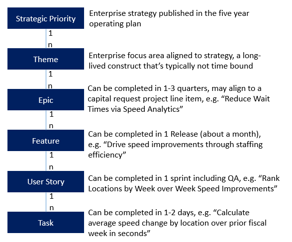
Figure 3: Requirements Hierarchy
Ensuring our stories all mapped into this requirements hierarchy made it easy to see all of the components required for a feature in one view, made it easier to split out the work across resources, and assign the stories to sprints in a way that would prevent any dependencies.
Early on, we would make the mistake of including stories for both engineering the data for a source AND publishing a visualization for that same data source in the same sprint. Because at this point, most of the data sources were net new sources that needed to be built from the ground up in the new environment, it would realistically take at least one whole sprint, if not two, to design the right schema, develop the ETL, and validate the data. We learned to carefully track three distinct capacity type buckets in sprint planning, where each capacity type had a different success metric they were owning that would contribute to our decommission goal, that they would report in weekly status meetings: Product Management capacity, measured by % adopted users on the new platform; Data capacity, measured by % data sources migrated to Redshift; and Visualization capacity, measured by % of utilized views migrated to Tableau.
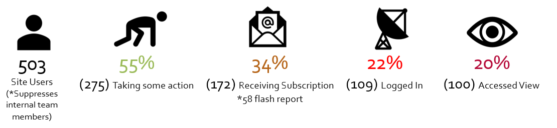
Figure 4 Sample Early Adoption Metrics tracked by product capacity
3.3 Cultivating Data Analytics Flow
In early sprints, we were aiming to decommission legacy platforms as quickly as possible, so we were just working to replicate legacy views into the new environment (think lots of tables). This worked well to start, because we knew we had to give users what they were accustomed to, having used the old system for the last ten years. But, what value is there for a user if you’re giving them the same old view with just a different looking user interface? We learned after some of our very first demo sessions to friendly pilot users that we couldn’t just give them the same set of tables we had before, we had to also delight them with sprinkles of new visualizations that could show the potential of the new platform, and make it worth them learning something new. Part of this was easy, because we were using Tableau, and there are tons of out-of-the-box features that wouldn’t require additional development on our part, but would delight the users, like the ability to subscribe to views (you don’t even have to log in to get your data!)
We started to get a lot better at the visualization component once Miki the CTO began forcing us to carefully craft a white paper for each dashboard we built. In the write-up we would articulate the business context, what tasks the user was trying to achieve, the questions they were trying to answer, and explore the right visualizations to fit those questions. At first this seemed like a daunting extra task that would slow down the build. But soon, we started to see the light, as pausing to think very carefully about what questions you’re answering actually results in a way faster, better initial draft than if you were to just jump straight into the data. We learned just because you COULD visualize something easily, doesn’t mean you SHOULD. So, we implemented a rule that every new dashboard required a visualization white paper, and we wouldn’t start the build until the white paper and design were fleshed out. Over time, patterns started to emerge with the types of sources we were engineering and the visualizations we were building. We generically had the following sets of tasks for a given feature requiring both engineering and visualization:
- Elicit key business decisions and process challenges
- Model Business Data Diagram to understand core data objects and the data domain
- Model Data Dictionary to elaborate object fields and necessary measures
- Draft visualization whitepaper to flesh out business decisions from the given data set
- Design Data Schema
- Design tables & transformations
- Engineer data pipeline
- Develop tables & views
- Load & validate incremental data (with monitoring and alerts)
- Define visualization dimension, measure, and interaction requirements
- Develop visualization
- Review & iterate visualization with users
Based on this repeatable process, we developed a data analytics estimation template in phases that may be helpful for you. You can download a sample of this estimation template here, which features a fun example of a movie theater looking to build a data warehouse and expand into subscription offerings.
3.4 Driving Adoption
I realized I could write a whole separate paper on how to approach adoption on a huge project like this. The most important lesson I can convey is to consider adoption from DAY ONE. Even if you have flawless development execution on a migration, if your users aren’t going to like the new environment, the project won’t be successful. We did this through a couple of ways:
- Get immediate access to utilization data of the legacy environments so that you can prioritize both your heavy users, and your most important views to be migrated first
- Compile a master user library and get to know the attributes of each and every user of your system so that you can group them into cohorts
- Don’t wait for a perfect data warehouse to start showing views to users. We actually developed the entire set of initial dashboards from our legacy Oracle data sources, so that we could get users bought in to the capabilities of Tableau. They didn’t actually care or know where the data was coming from, but doing this allowed us to get a hefty proportion of users on the new platform before we even had one Redshift data source live in production.
The other part about stakeholder adoption, more for our internal teams than the franchisees, is you will likely need to coach your business partners on what it means to be agile. All too often we would get hit with requests like, “I need this view, can you give it to me by <insert unrealistically soon date here>.” We started to teach them about our sprint schedules, and how in order for us to deliver a view successfully, we would need to go through an iterative lifecycle of elicitation, design, and development before we could release something to them. By the end of the project, it was a delight to hear stakeholders referring to requests by saying, “I know you probably can’t get this in to the current sprint, but do you think we could slot this in to Sprint X?” Like I said, I could go on for days on this topic alone. Stay tuned for a follow up paper with a deep dive on adoption for agile projects, including which data visualizations are most useful for prioritizing adoption cohorts and views to migrate.
3.5 Where Are They Now
Through this journey, we successfully decommissioned all legacy environments, starting with Oracle, then SQL, then the transaction-level data cubes and its visual counterpart ProClarity. Meera remembers the day we turned off Oracle with such happiness, because Miki was so happy, the team was ecstatic, and we felt a surge of confidence moving in to the next phase. By spring of 2019, all users were on Tableau and loving the new platform. The AWS Redshift data warehouse contains not only all of the legacy sources in scope for migration, but totally new datasets that users never had before. After the heavy lifting of the migration was complete, we looked to scale down the team and move to “run the business” mode. I helped the Jack team find my replacement, Mike Sebeckis, who joined in the fall and began learning the ins and outs of the wealth of our data and views. By May 2020, I rolled off, confident the team was in a position to continue transforming the way Jack users looked at and leveraged data in their processes. As of today, the Jack full-time-employee team is holding steady with Mike, Meera, and Poonam at the helm. The business looks to the DnA team as a partner and ally as they continue to deliver new insightful views to support the organization’s strategic priorities. I checked in with Mike to gauge the health of the team. Here are some of his highlights:
- “We’re still using agile at Jack in the Box and I don’t see that changing anytime soon. Our two-week sprints are a great way to compartmentalize chunks of work as we piece things together for larger feature related rollouts. Organizing work into sprints also enables us to prioritize both our short-term and long-term roadmap, so that we can clearly communicate release dates to our business partners.”
- “Our stakeholders are very happy with the DNA team. I think when it comes to Data and Analytics, trust is paramount. One slipup and that trust can deteriorate very quickly. I’m not saying we’re perfect, but we’ve built a reputation of delivering a quality product to our stakeholders, while maintaining open lines of communication with our business partners.”
- “I’ll never get tired of delivering an insight to a business partner that they might not have ever considered. We’re often handed a set of requirements that says, “This is what we need”, but my favorite part of the job is taking that request to the next level and delivering something that they never knew they needed.”
Meera, Mike and Poonam continue to evolve in their mastery of data tools and skills. Poonam is now an expert at Redshift and loves dabbling with machine learning models. His proudest accomplishment from this effort was definitely our transaction-level data. Other teams had tried for months to tackle this subject area, and once we learned Redshift, we were able to complete the work in a month. He’s honing his Python skills and leveraging available libraries like Beautiful Soup to continue refining and streamlining our data pipelines. Meera is also now a Redshift Jedi, and taking on most of the front-end visualization development as she continues to conquer Tableau and grow as a well-rounded analytics professional. Mike is eager to expand his knowledge of cloud computing, particularly with the AWS tools we have available surrounding our Redshift cluster. Meera looks back on where we’ve come through this journey and mused: “Before we started this project, I was not a fan of agile. But, after seeing how things are supposed to work and how it helps run the project successfully, I am a believer… developers should speak up, product owners should know what we need to add value to the business, so the team can find a kind of balance. This has made agile so much more meaningful for me.”
By the way, Mike’s biggest fear is heights. “I once made it to the first level of the Eiffel Tower (not even a third of the way to the top) but couldn’t bring myself to get on the elevator to the next level because my knees were shaking too much.” Thanks Mike for the setup of the corniest joke in history: I really hope Mike gets over his fear soon because with his new skills and this data platform his career will be soaring to ALL new heights!
4. WHAT DID WE LEARN
We learned so much, and I continue to think back with joyous memories about the lightbulb moments that hit me throughout the project. To summarize all of the paragraphs above in a few bullets, we learned:
- Sandbag initial estimates for new technologies and account for cloud learning curves (like seriously, probably double what you think at first).
- Don’t commit to a big bang decommission goal, but rather break this down into specific goals by platform, in a clear priority order.
- It’s totally OK for your initial plan to be wrong. This is, after all, agile—an EMPIRICAL process by which we gain knowledge through experience.
- Organize your requirements hierarchy with object definitions everyone can agree to; enforce traceability across every level so that you never lose sight of the big picture.
- Clearly list out all dependencies for a story and call them out in grooming and sprint planning.
- Don’t overcommit, especially with a small team that’s ALSO handling production support cases.
- Don’t get comfortable with moving a story to the next sprint if you can’t get to it. Be clear-cut in your commitments. Limit scope so you can get things from Dev to QA to Production and put a bow on it before the sprint is over. If you do decide to take a risk on uncertain scope, call it out as a stretch goal.
- Curate buckets of capacity in workstreams that can deliver measurable value in parallel (and organize your roadmap and sprints this way). For us, this was product, data, and views; your tracks may be different depending on the context of the project.
- Minimize delays in user story execution through careful sprint orchestration of dependencies (if new data is needed for a view, ensure that’s available at least 1-2 sprints ahead of the dashboard story).
- Define a pattern for your features and leverage it across data sources and visualizations.
- Deeply understand the business decision a stakeholder is trying to make before designing a dashboard for them; we found the use of visualization white papers to be helpful in this regard—not necessarily to create the paper itself, but to create a pattern of thinking processes that facilitates empathy with the user’s data needs.
- Think about adoption from day one and consider it your most important deliverable. Get value into the hands of users from the front-end to vet the experience before investing in full end-to-end development.
- Coach the business on what it means to be agile, how they can contribute to the iterative delivery process, and that every request will require a lifecycle of analysis, design, and delivery.
5. ACKNOWLEDGEMENTS
First and foremast, thanks to my Jack in the Box team contributors: Meera Jadhav, Data Engineer; Mike Sebeckis, Product Manager; Poonam Chaganraj, Data Architect. I want to thank Jack in the Box leadership for believing in us and investing in data (CTO Miki Hardisty, who has since moved on to a new organization; CIO Drew Martin; and COO Marcus Tom). Of course I want to thank my Seilevel team—President Anthony Chen who initially kicked off this effort and handed it off to me; and Alex March, Chris LaChance, Jake Shimota, Roland Smets and Wes Lacson who became like family, have given me so many fond memories, and made delivery of this excellent product possible. Finally, I’d like to give a HUGE thanks to Kathy Bine who shepherded this paper along the way and inspired me to keep going, even through pandemic-inspired writer’s block, and my unfortunate pattern of procrastination.